Get Started | Edit an Existing Page | Create a New Page
Get Started
- Please make sure you are connected to VPN if you are not on campus.
- Open the page you'd like to edit in your web browser (we recommend using Chrome).
- In the URL, replace "www" with "stage" and press the enter key.
- Click on the pencil icon, located in the top right corner of the browser window.
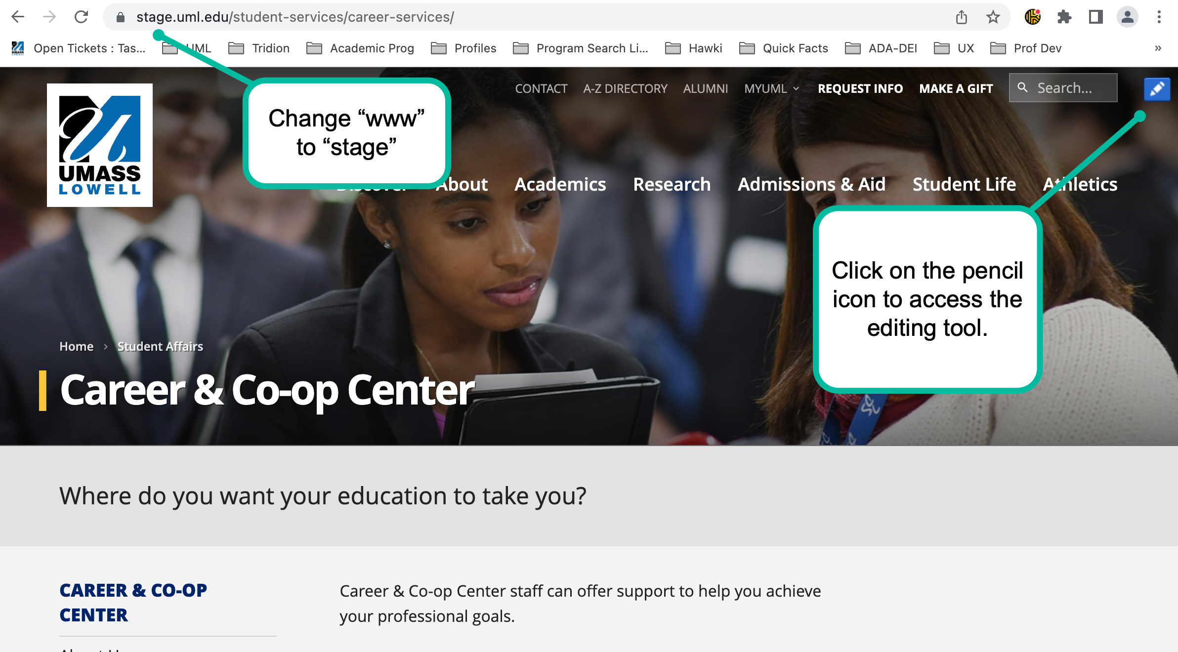
- If you are not already authenticated to UML SSO you will be redirected to the authentication page, enter your UML email address and password and click on "Next."

For best results, use Chrome browser and be sure to set your pop-ups blocker to allow tcm pages to open.

Website Building Blocks
The main building blocks used to create websites are Components, Component Schemas, Regions, Region Schemas, Pages, Page Templates and Page Schemas.
The Content Manager enables you to create content and layout items separately and then to combine these items to create publishable Pages. As a result, teams in your organization can accomplish what they do best. For example, authors can create content, designers can design the look-and-feel of Pages, and editors can determine what content is published where. Depending upon your role you may participate in creating or using any of these building blocks.

Component Schemas
A Component Schema, often simply called Schema, defines the structure of Component content and determines the type of content that authors can create. For example, a Schema called "Press Release" could define the following fields: Headline Date Summary Body
Components
Component is a collection of text or multimedia content based on its Component Schema. Components based on the same Component Schema share the structure defined by that Schema. You add Components (or Component Presentations) to a Page's defined Regions, including the Page itself.
Component Templates and Component Presentations
A Component Template defines how Components are displayed and behave on a webpage. The combination of the Component Template with the Component creates a publishable piece of content called a Component Presentation.
Regions
A Region represents a content area on a Page, and can contain Component Presentations and/or further Regions. In fact, a Page is considered the top-level Region. Regions are only defined for specialized page types. For the most part we have only the page as a container for component presentations.
Pages
A Page is a top-level Region, which contains one or more Component Presentations.
Page Templates
Page Templates define how a published webpage is generally constructed and behaves.
Items with borders
This diagram is a schematic representation of a part of a webpage showing editable areas through borders

Borders appear around the following types of items
| Item | Border Appearance |
|---|---|
| Webpage (1) | If the webpage as a whole is editable, a border appears around it when hovering over the edge of the page. |
| Component (2) | If a Component on the webpage is editable, a border appears around it when hovering over the Component. |
| Field (3) | If a field of a Component is editable, a border appears around it, but only if you select the Component first and then hover over the field. This also goes for fields within fields (4). |
Border colors
The color of an item border tells you something about the status of that item.
By default, an item can have a border in one of the following colors:
| Color | Meaning |
|---|---|
| blue | You can edit the item. |
| green | There are pending changes to this item for you to commit or discard. |
| red | Your changes cannot be saved, because the content you entered is invalid or incomplete. |
| grey | You cannot (currently) edit this item. |
These colors are defaults.
The color of borders around the fields of a Component are as follows:
- If the Component has a blue or green border (or its configured alternative), so do all of its fields.
- If the Component has a grey border (or its configured alternative), its fields have no borders.
- If the Component has a red border (or its configured alternative), the field or fields that are invalid also have a red border (or its configured alternative). Other fields have a blue or green border.
At any time while editing, you can change when to display borders in one of the following ways:
- You can show all borders to identify which parts of the page (Components and the page itself) are editable.
- You can show borders only when you hover over items (default).
Borders around Experience Optimization regions are unaffected by this setting. They are only displayed if you explicitly select a region in the Page Properties popup or if you drag and drop items.
Borders around individual Component fields are also unaffected by this setting. They only appear when you select a Component and hover over its contents.
- To show all borders on the page, in the Home tab of the ribbon toolbar, select Content Borders.
All borders are now displayed, even if you do not hover over an item or select it.
- Alternatively, to show borders only when hovering over the item, in the Home tab of the ribbon toolbar, deselect Content Borders.
Borders are now only displayed if you hover over an item.
Publishing
Normally, your Page is published whenever you select Finish Editing. Explicitly publish a Page to schedule or otherwise configure your publish operation, or to publish to another destination than the staging website.
- On an editable webpage, start editing by clicking the pencil button in the top right corner.
- Select the Page by clicking on its border, and in the Manage tab of the ribbon toolbar, select Publish to open the Publish dialog.
- You can set a number of options in the Publish dialog:
- You can publish to different and/or multiple targets by selecting those targets under Choose One or More Target Types to Publish to.
- You can publish the Page at another time than now by selecting Publish Content Later in the Publish Settings tab to display a date and time selector. Click the Calendar icon to pop up a date picker and set the date and time at which you would like the publishing process to start.
Note: The moment you specify is the moment at which the publishing process will start. If publishing takes a long time, it may appear on the website much later than the date and time you specify.
- To specify a date and time at which you want the Page to be unpublished from the website (that is, removed from the site), in the Unpublish settings tab, select Schedule unpublish and specify a date and time at which you want the Page to be unpublished from the website, using the same controls as in the Publish content later option.
- You can give the publishing of this Page priority over the publishing of other content being published at the same time by selecting the Advanced tab and selecting Override publish/unpublish priorities and setting the priority to high.
- You can publish this Page also to websites that inherit content from the current website, by selecting the Advanced tab and selecting Also publish/unpublish in Child Publications.
Note: This option only appears if there are other websites that inherit content from this website.
- You can see which items are going to be published or republished when you click Publish by clicking Show Items to Publish.
- When you have selected the target or targets and you have set any options you might want to apply, click Publish to submit the Component for publishing.
This Page is submitted to be published. This means that an attempt is made to republish the current webpage, to the target or targets you specified. Except if you are a member of the Web Content Team, the only target you can publish content to directly is the "Stage" target.

Workflow
It is important to understand that the content created and updated on the Stage website and published to the Stage website is not immediately available on the Live website. The Stage website is the environment where a user can draft, test and collaborate with others to create their website's pages and content.
Once the final draft is complete the content can be submitted to workflow where the Content Team can review and approve the content, at which point they will publish it to the Live website; available to the public.
Equally important is to realize that once an approved version of the content is published to the Live website a user can edit the content on the Stage website without impacting the Live website. Any updates requires the Content Team to review and approve the changes before they will publish it Live.
Generally the workflow process consist of the following steps (or activities).
- Editor steps performed by the content editor:
- Create or Edit Content - the user is working on making updates to existing content or creating new content.
- Publish for Preview - the user is still working on the content but wants to view the content on the Stage website and most likely share the updates with others in their team.
- Submit to Worfklow - the user notifies the Content Team that they are done making updates and want their content published to the Live website
- The following steps are only available to Approver users - usually this will be the Content Team or in some cases department specific content approvers.
- Reject - Additional changes are required and the item is assigned back to the original editor at the Create or Edit Content step.
- Approve Live - Content is approved and will be published at a later time. No additional actions are required from the original editor to complete the workflow process
- Approve Live and Publish - Content is approved and will be published immediately. No additional actions are required.
Each of these workflow activities can have one of two states: Assigned or Started
When an activity has the Assigned state nobody can edit it, but users who are members of the group to which this Activity is assigned (or if assigned to a user directly) can Start the activity. Once the activity is started, the user that started the activity can edit the content. To move the activity to the next step in the workflow process the user must Finish the activity.
VIDEO: Paste from Word (X min.) <to come>
When you add text from a Word document or email, you must use a "plain paste" to strip any formatting from the text. This avoids carrying over unnecessary code.
To paste text without formatting, use the following keyboard shortcuts:
- PC Plain Paste: Ctrl + Shift + V
- Mac Plain Paste: Shift + Option + Command + V
Pro Tip: Font styles and colors are preset in Tridion and cannot be changed for design purposes.
Edit an Existing Page
VIDEO: Headings (X min.)
When formatting headings, please use only Heading 2 and Heading 3. (The page title is considered Heading 1.)
To format a heading:
- Select the text you want in the heading.
- In the formatting toolbar, click on the Section Type dropdown and choose Heading 2 or Heading 3.
Alternatively, you can place the cursor in the line that needs the header change and select an option (Heading 2 or Heading 3 only) from the dropdown menu.
Video: Upload an Image (3:23 min.)
Ensure that the image you want to insert is in either PNG or JPEG format.
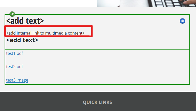
Position your cursor at the text "<add internal link to multimedia content>" to insert the image.
- On the left side of the window, locate the sliding window labeled "Building Blocks"
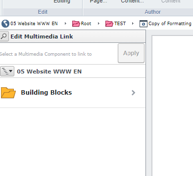
- Click on the arrow next to "Building Blocks" to expand the options.
- From the expanded options, click on "Content" to navigate to the desired folder within your department folders.
- Next, go to the "Multimedia" folder and select the "Images" folder.
- Next, you have two options:
Click the gray bar at the bottom of the window and browse to the folder where you saved the image on your computer. Select the image and click "Open".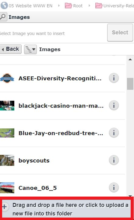
Alternatively, you can drag and drop the image from your computer directly into the Image popup window. - The Metadata window will appear.
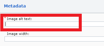
- Add a description of the image in the provided field.
- Click "Save and Close".
Video: Add an Image to a Page (to come)
Ensure that the image you want to insert is in either PNG or JPEG format.
- Position your cursor on the section of the page where you want to add an image. Then click on Open in Form View.
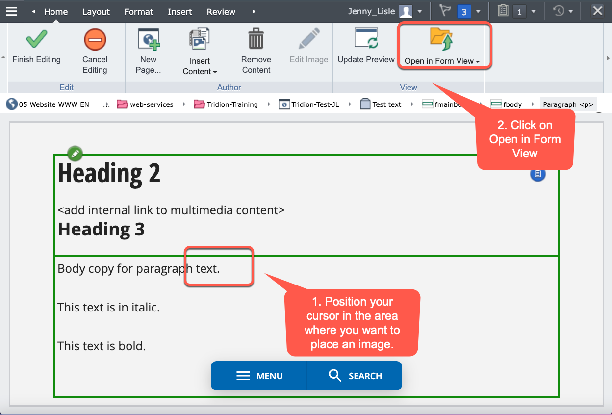
- Scroll down the window to find the Image field. Click on the Search Icon.
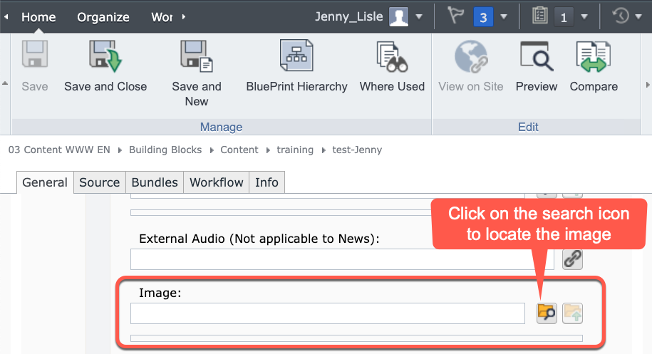
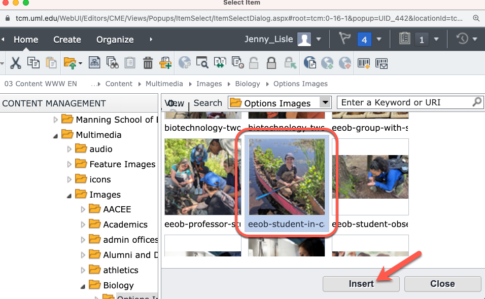
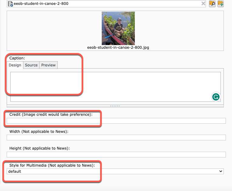
- Add a caption and/or credit text.
- Change the position of the image. The image will automatically display to the right of the body text. To change the position, click on the menu under Style for Multimedia to choose left, right, center or bottom.
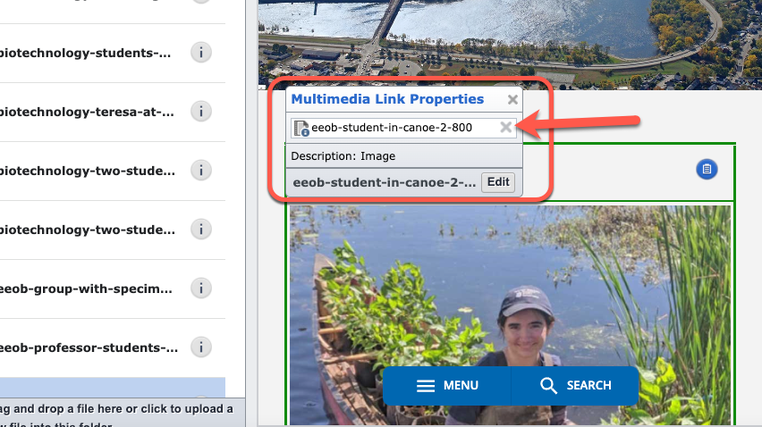
- Click on the image and a Multimedia Link Properties pop-up window will appear. Click on the “X” to remove the image.
email link | internal & external links | anchor link
Email Link
- Highlight the email address to be linked (it's best to type the entire email address rather than use a person's name).
- Navigate to the Insert tab in the ribbon toolbar and click on "Hyperlink".
- In the "Type" field, select "mailto".
- In the "URL" field, type the appropriate email address immediately after "mailto:" (without a space after the colon).
- In the "Title" field, add the email address.
- Click "OK" to create the link.
Pro Tip: Remember to save your changes by clicking outside of the component frame.
Internal & External Links
- Highlight the content you want to link.
- Select the "Insert" tab in the ribbon toolbar and click on the Hyperlink icon.
- In the popup window,
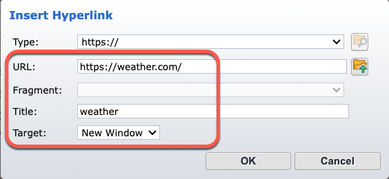
- URL: Paste the external URL. (Make sure to remove any duplicated "http://" or "https://".)
- Title: Write the name of the hyperlink or a word or phrase that describes the link. (This will appear when you hover over the link.)
- Target:
- For Internal Link - Choose "Default."
- For External Link - Choose "New Window." (All links outside of uml.edu should open in a new bowser window.)
- To test the link, click on the folder icon (Open) on the right of the URL field.
- Click "OK" to create the link.
Pro Tip: Remember to save your changes by clicking outside of the component frame.
Anchor Link
An anchor is a link to a named position in the same component.
- To insert an anchor, move the cursor to the desired position in the content where the hyperlink should point, and click there.
- To create quick links to different sections of the content, make the section titles anchors, and duplicate them at the top of the content. Then link the top titles with the corresponding sections.
- For example, to create an anchor named "libraryweek" for the section titled "Celebrating national library week":
- a. Move the cursor to the beginning of "Celebrating national library week" and click once.
- b. Click the Insert tab in the ribbon toolbar and select Anchor.
- c. Name the anchor (without spaces) as "libraryweek" and click OK.
- To link the top duplicated title with the corresponding anchor:
- Highlight the title, "Celebrating national library week."
- Select Hyperlink.
- Under Type, select Anchor and under Anchor Name, choose the corresponding anchor "libraryweek."
- Click OK to save the changes.
- When you are creating your next anchor link, you can find the other words you selected in the drop down in the anchor field.
- To save the changes, click outside of the component frame
- Make an anchor in Component B and name it (for example, "test"), save and close.
- Open the Component A and highlight the the part of the content to link to the anchor.
- Click on Hyperlink button and select Other (under Type) and type "#name of the anchor" (in this case "#test"), then save and close.
- Highlight the content that you want to link to the file.
- Select the Insert option in the ribbon toolbar, then choose Hyperlink.
- Set the Target to "New window" and select Component as a type.
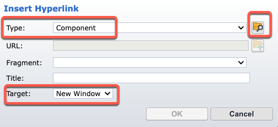
- Click Browse (the icon of the folder with a magnifying lens), and navigate to the correct folder in the slide window.
- Open the docs folder within your department and click on it.
- If you are adding a new file, drag and drop the file into the bottom field or click the grey bar.
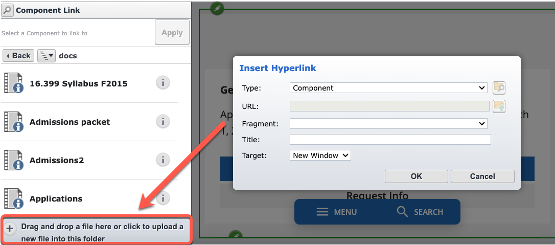
- Locate the file you want to upload on your computer and double-click on it. Note that the file name should not include any characters such as +, #, &, @, %, !, or /.
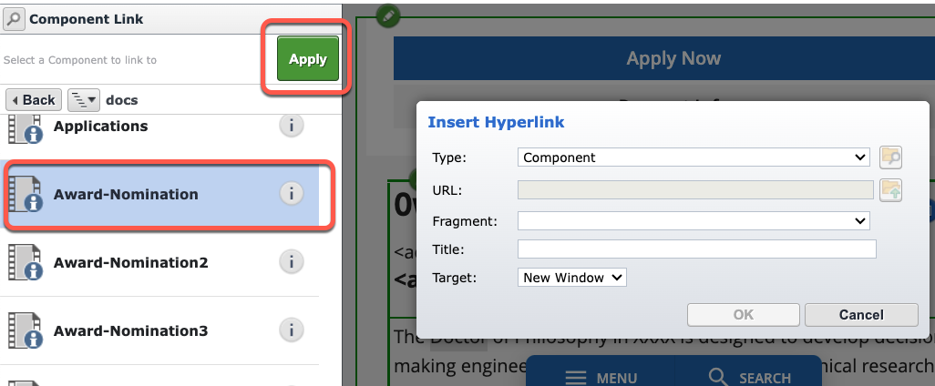
- Once the file is visible in the docs folder, click Apply.
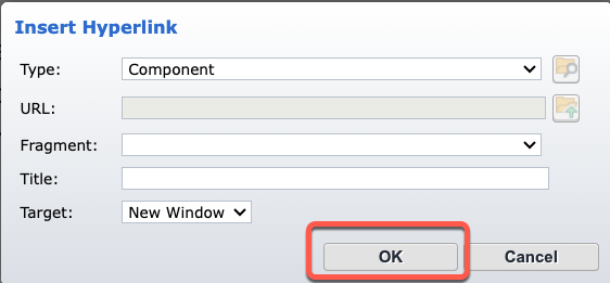
- Click OK in the Hyperlink window.
- To save the changes, click outside of the component frame.
createVIDEO: Create a Table (2:56 min.) <Q: should we update?>
- Place your cursor at the location where you want to insert the table.
- Click on the Insert tab in the ribbon toolbar.
- Click on the Table button.

- In the Insert Table window, enter the number of rows and columns you want.
- Click OK when done.
- A table editor window will pop up.
- By default, the content will be Body style (normal formatting).
- To make a table heading, select the Row tab, click inside the row, and in the Row Formatting menu in the Body/Header/Footer section, select Header.
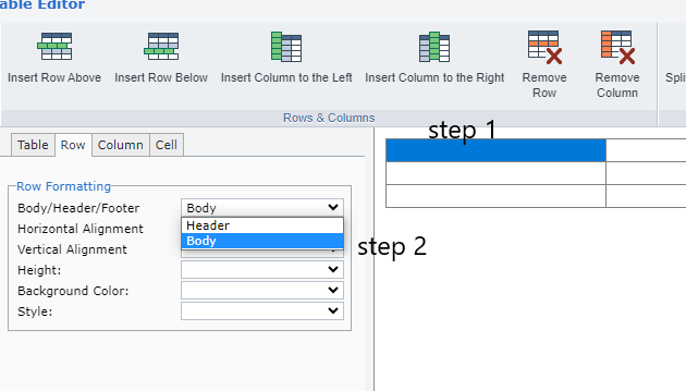
- Click OK.
- In SiteEdit mode, click inside the cell and type the table content.
- To save the changes, click outside of the component frame.
VIDEO: Edit a Table (2:08 min.) <Q: should we update?>
- Click inside the table that you want to edit.
- In the formatting toolbar, select "Format".
- Under the "Current Elements" drop-down menu, select "Table <table>".
- Click on the "Table" button located under the "Insert" tab.
- In the "Table Editor" window, click inside any cell to activate the top menu.
- Use the top menu to remove or insert rows above or below, as well as to remove or insert columns to the left or to the right.
- Apply the changes by clicking "OK".
- To save the changes, click outside of the component frame.
Edit metadata to provide information about the item you are editing. You edit metadata in a popup because typically, metadata does not appear on the webpage.
- Select the border of the Component whose metadata you want to edit, or the border of the entire page, if you want to edit the metadata of the page, and do one of the following:
- Click the Show Properties border button that appears in the top right corner.
- Click Properties in the Home ribbon toolbar tab.
The properties of the Component or page appear in a popup.
- Find the area called Metadata and click the Edit button.
- If you see a Show button instead of an Edit, you either have no permission to edit the metadata, or another user is editing the metadata.
- If you do not see this area at all, the item has no metadata, or you have no permission to view them.
A popup opens, showing the metadata fields of this Component or webpage as a form.
- Edit the metadata in the form. The editing controls in this popup are similar to your editing controls on the webpage, with the following exceptions:
- Editing a selection
- Selection controls may display as a select box, dropdown or radio buttons. Multivalue selection controls may display as checkboxes.
- Creating a new Keyword and adding it to a selection field
- If you are sufficiently authorized, you can create and add a Keyword by clicking the Add button next to the selection control.
- Adding, moving or removing items in a multivalue field
- The controls for adding or removing items in a multivalue field appear to the left of each item in the multivalue field. To move items around, click the Move button, which changes your mouse pointer into a move icon, and drag the item to its desired new location in the list.
- When you are finished, click Save and Close at bottom right.
- Click the Finish Editing tab in the formatting toolbar to exit editing mode.
- Click the link icon in the top right corner of the editable border.
- Copy and save your URL in a location where you can easily find it. Alternatively, you can find it in the Recent Items tab located in the top right corner.
- Click the "X" button in the top right corner of the Tridion page (not the browser).
- Click the "Continue editing later" option.
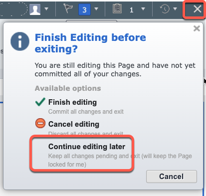
- When ready to edit the page again, paste the saved URL into the browser and log in to Tridion.
- When prompted with a message, click the "Update" button located in the top right corner of the page, or click "Update Preview" in the ribbon toolbar.
VIDEO: Preview & Submit to Workflow (X:XX min.)
Preview your edited page
- Click outside the component that was being edited.
- Go to the Home tab in the ribbon toolbar and click Finish Editing.
- To preview the page before submitting, go to the Things to do tab in the top left corner.
- Select the component you want to preview.
- Click Finish Activity.
- In the Next Activity drop-down menu, select "Publish for Preview".
- Click Done.
- Click on the link icon and copy the stage page URL.

- Open a new browser tab and paste the URL to preview the links and the page layout.
- If you need to make more edits, return to "Things to do" and click "Assigned".
- Select the component you are working on.
- To continue editing, click "Start Activity" and edit the component. Otherwise, follow the next step.
Submit to Workflow
- Click Finish Activity in the ribbon toolbar.
- In the comment box, summarize all the edits and add a message to the web content team if necessary.
- If you need to add a page to the website's left-hand menu "Navigation", specify the exact location.
- In the Next Activity menu, select Submit to workflow.
- Click Done.
Create a New Page
VIDEO: Create a New Page (5:00 min.)
- Under the ribbon toolbar, select the Home tab.
- Click on the New Page button.
- From the slide window on the left, choose the specific page within your department.
- Click Create.
- In the pop-up window that appears, fill in the Page Title and the File Name. Ensure that the Page Title and File Name are the same, and use a dash instead of spaces in the File Name. For example: Page Title "Study Abroad", File Name "study-abroad"
- To change the page title, right click on Page Title space and select Open in Form View.
- Once in the backend, change the page title, and add the navigation title if the page will be linked from navigation. And then click Save and Close.
Change the Page and Component Locations
- If you want to change the page location, click on "Change" next to the Page location field. In the window slide, navigate to the desired folder (indicated by the pink color) and click "Change" and navigate to the desired folder (pink folder).
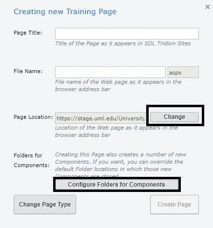
- If you need to change the location of a component, click on "Configure Folders for Components". Then click "Browse"
- Navigate to the desired folder (indicated by the yellow color). Finally, click "Select".
- Once you have set the desired locations, click on "Create Page".
- The page will reload with a new template, displaying a blank page.
- Hover your mouse over the [Page Title] and right-click. Select "Open in Form View". This will open the page in the back-end of Tridion rather than SiteEdit.
- If necessary, you can edit the display title and add a navigation title.
- After making the desired changes, click "Save and Close".


To change the position of image click the drop down for "Style for Multimedia(Not applicable for News". Following are the available position:
Default : This will make image to right of content
Left: This will make image to Left of content
Right/: This will make image to right of content
center: This will make image to center of content
Bottom: This will make image to bottom of content

- The Recent Items list displays the last 10 items that have been saved by the user.
- You can access the Recent Items list in both the Tridion Content Manager Explorer (CME/Backend) and Experience Manager (SiteEdit) editor interfaces.
- The purpose of this feature is to provide an easy way for users to access recently saved items without having to navigate to their specific location in either editor.
- This feature is particularly useful in SiteEdit, where users rely solely on the website's navigation structure to find content for editing.
- To activate the feature, click on the Recent Items icon located on the user information bar in the top right-hand side of the editor window.
- A list of recently saved items will expand. If no new items have been created or existing items updated, an empty list will be displayed, indicating that the last edited items will be shown when available.
- Each item in the list contains the following information:
a. Item Icon
b. Item Title
c. Date/Time when the item was saved
d. Location of the item (either the Stage page URL or CME location) - The types of items displayed in the Recent Items list vary depending on the interface context, either CME or SiteEdit. In the CME interface, all editable item types will be listed. In SiteEdit, the types are limited to Pages and Components.


