Recalling the River Hawk
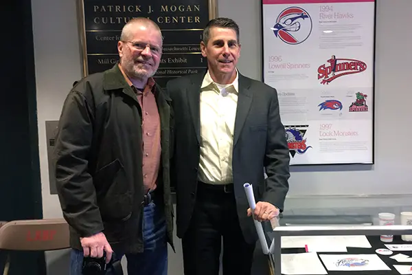 Image by courtesy photo
03/29/2018
By David Perry
Brian Trainor recalls opening the letter from the UMass Lowell alumni group back in 1994. The university was holding a contest to adopt a fresh name and logo.
The 1980 art graduate, then working for a design firm, got to work.
Trainor’s work would help change athletics history at UMass Lowell, and it is a key part of Branding Lowell: A History of Local Design, an ongoing exhibit at the Patrick J. Mogan Cultural Center. The exhibit is co-sponsored by the university and Lowell National Historical Park. (A satellite display is on the fourth floor at Mill No. 5 at 250 Jackson St.)
Branding Lowell is the brainchild of Mark Van Der Hyde, a digital project manager at a marketing strategy and product design company called Maark and a fan of graphic design, and Tony Sampas, the UMass Lowell library digital archivist. Nearly a year in the making, the exhibit began when Van Der Hyde showed Sampas images of marketing bumper stickers and Lowell’s Sesquicentennial logo. He knew Sampas sat on the Lowell Historical Society and told him they should be “saved for posterity.”
Using flags, logos and other designs, the exhibit shows how branding has presented the city, including UMass Lowell, over the years. There’s a history of city government symbols, hospital branding, some mill history and a look at iconic brands born locally, including Father John’s Medicine and the like-it-or-you-don’t soft drink, Moxie. It covers ground as recent as the signage for the sides battling for location of the next version of Lowell High School.
It wasn’t easy, say the two men, but the exhibit is composed of design that is so often taken for granted, it often escapes notice. And this is the first time it has all been gathered in one place.
“Organizations and communities need visual symbols, and sometimes mottos, to define their values and mission,” says Sampas. “When the institutions grow, change and even merge with others, as was the case with the Lowell Textile and the Teachers School, the symbols need to move from the particular, such as cotton bolls, sheep and abacuses, to something broader.”
Sampas says the current logo – a swan-like U within an M – “attests to this progression in a compact graphic, literally progressing from the select to the universal.”
Trainor – with help – was responsible for the River Hawks logo. His sketches showing the development of the logo are part of the exhibit’s UMass Lowell items. Also traced through the years is the university’s seal, which morphed as the university changed.
When the contest started, Trainor, who now teaches at Whittier Regional Vocational Technical High School in Haverhill, did some sketches. He created an image of a bird of prey – the osprey, a fish-eating raptor that nests along rivers, including the Merrimack. Blue and white on a field of red.
“They’re fierce hunters, and indistinguishable as male or female except by a vet, so it would work with both men’s and woman’s teams,” said Trainor, who has also designed logos for Lowell’s Lock Monsters minor league hockey team and the Lowell Folk Festival. “And they’re indigenous to the area, still there right along the river.”
He brought in friend Bob Lucier to help with computerization of the image. Then he skipped the formalities of submitting the logo to a panel. He knew whose opinion mattered most.
“I mounted it on a presentation board, packed it up and carried it to Director of Athletics Dana Skinner’s office. The door was open. He didn’t kick me out.”
Skinner loved the image but “hated” the name ospreys, recalls Trainor. Skinner pulled out one of the 154 public submissions for a new name, “Hawks,” suggested by Westford’s Chad Dooley, a member of the YoungStar youth fan club.
“I like Hawks,” Skinner said. Trainor wasn’t about to argue.
It became, and has remained, River Hawks.
The exhibit, which will run through the summer, is open weekdays from 9 a.m. to 5 p.m. and on weekends from 1:30 p.m. to 4 p.m. (and 10 a.m. to 4 p.m. the third Saturday of each month).